5 Sections That Make a One Page Resume Work (Plus German Rules)

A one-page CV suits graduates, career-changers with limited relevant history, and anyone applying to high-volume or fast-moving roles where recruiters scan fast. The single most important edit is not trimming words. It is deciding what belongs in the top third of the page, because that section carries most of the weight with both recruiters and applicant tracking systems. The sections below cover templates, structure, editing steps, and formatting rules to get there.
TL;DR:
- Focus your top third on the most relevant achievements and keywords, as this is what recruiters and ATS will prioritize.
- Use a simple, single-column layout to ensure your CV is easily parsed by software and easily readable by recruiters.
- Highlight only the most recent and impactful roles, consolidating or removing older, less relevant experience to save space.
- Incorporate measurable achievements with action verbs and numbers to demonstrate impact efficiently on a single page.
- Tailor each application with a relevant, ATS-friendly format and run final checks on font size, spacing, and file naming before submitting.
Table of Contents
- What template layout works best for a one-page CV?
- What sections belong on a one-page CV?
- How do you edit a full CV down to one page?
- How should you format a one-page CV for ATS software?
- What does a good before/after CV edit look like?
- Where can you find reliable one-page CV templates?
- Is a one-page CV always the right length?
- What is the final checklist before submitting a one-page CV?
- How do you use action verbs and numbers on a tight page?
- How do you list gaps, freelance work, or part-time jobs?
- How do you fit a career change or multiple roles on one page?
- Author perspective: what most one-page CVs get wrong
- Let Appliqu handle the tailoring and the tracking
- Sources
- FAQ
What template layout works best for a one-page CV?
The right layout depends less on personal taste and more on how much content you actually have to fit. A single-column layout, reading top to bottom with no side panels, remains the safest option for applicant tracking systems, because parsing software can misread text pulled from two columns and jumble the order of your experience.
Two-column layouts look sharper and can help specialists compress a long skills list into a small footprint, but they carry parsing risk. If you use one, keep your job titles, employer names, and dates in the main column, and push only supporting information (languages, tools, interests) into the side panel. Never split your work history itself across both columns.
Compact or hybrid templates sit between the two: single-column structure with tighter spacing, smaller header treatment, and a condensed skills row near the top. These work well when you have four or five roles to list and standard formatting leaves you a paragraph over the page limit.
Which layout fits which career stage:
- Graduates and early-career candidates: single-column with a strong education and projects section near the top, since work history is thin.
- Specialists and technical roles: two-column or hybrid, with a dense skills or tools list positioned where it is scannable in seconds.
- Career changers: single-column with a skills-first order, so transferable ability appears before the employment history that might look unrelated on paper.
- Senior individual contributors staying to one page: compact/hybrid, condensing older roles into single lines to protect space for recent achievements.
On file format, export to PDF unless a job application system explicitly asks for a Word document. PDF preserves your layout across devices and print runs, while a DOCX file can shift its formatting depending on the software opening it. Keep a DOCX master copy for your own editing, and generate a fresh PDF each time you tailor the content, rather than reusing an old export. Indeed's one-page template guidance shows several of these layouts side by side, which is worth a look if you are undecided between single-column and compact styles. Adobe Express also publishes editable one-page templates that demonstrate the range between minimalist and denser designs, useful for seeing the trade-offs before you commit to one structure.
What sections belong on a one-page CV?
Five sections do almost all the work: contact details, a profile statement, relevant experience, skills, and education. The National Careers Service lists these as the core building blocks of a concise CV, and on a single page there is no room for a sixth.
- Contact details. Name, phone number, email, city (full street address is unnecessary), and a LinkedIn URL if it is current. Keep this to two lines maximum.
- Profile or personal statement. Three to four lines, no more. State your role or specialism, one standout achievement or years of relevant experience, and the type of position you are targeting. Avoid generic openers like "hardworking professional seeking opportunities": name the actual value you bring.
- Relevant experience. List roles in reverse chronological order, but only the ones that support your target job. Each role gets a title, employer, dates, and two to four bullet points focused on outcomes, not duties.
- Skills. A short, scannable list of tools, languages, or technical competencies relevant to the role, ideally seven to ten items rather than an exhaustive inventory.
- Education. Degree, institution, and graduation year. Drop module lists and grades unless you are a graduate with little else to show.
Order matters as much as content. Experience-first ordering suits anyone whose most recent job title matches or supports the role they want. Skills-first ordering works better for career changers, because it puts transferable capability ahead of a job history that might otherwise read as irrelevant to a recruiter skimming for ten seconds. For most other candidates, stick with the conventional experience-first sequence: it matches what recruiters expect to see and where they expect to find it.
How do you edit a full CV down to one page?
Cutting a two-page CV to one page is a filtering exercise, not a font-size problem. The workflow below, adapted from the editing approach Prospects recommends for concise CVs, works whether you are trimming your first draft or condensing years of accumulated detail.
- Dump everything first. Write out every role, project, and qualification without worrying about length. You cannot cut intelligently from a blank page.
- Apply a relevance filter. For each item, ask whether it supports the specific job you are applying for. If it does not, cut it, no matter how proud you are of it.
- Rewrite duties as achievement bullets. Replace "responsible for managing client accounts" with something like "managed 40 client accounts, reducing churn by tightening onboarding." One line, a verb, a number where you have one, and an outcome.
- Consolidate older roles. Anything more than ten years back can usually collapse into a single line: job title, employer, and dates, with no bullets underneath.
- Remove low-value items entirely. References, "hobbies and interests" (unless directly relevant), and lines like "available on request" or "excellent communication skills" with no evidence attached all cost you space without adding proof.
- Tighten the micro-formatting. Shorten "January 2023 to Present" to "Jan 2023–Present," drop full stops at the end of bullet points, and use consistent abbreviations for degrees and certifications.
Pro Tip: Print a PDF export before you call it finished. Screen editing hides small overflow, and a stray line spilling onto a second page is easy to miss until you see it on paper.
The deeper discipline is treating every remaining word as competing for space against every other word. If a bullet does not change how a recruiter judges your fit for the role, it has already lost that competition.
How should you format a one-page CV for ATS software?
Font choice and spacing decide whether your content fits, but file structure decides whether an applicant tracking system can read it at all. Oxford's careers guidance notes that recruiters scan CVs quickly, which means your formatting has to work for a human skim and a machine parse simultaneously.
- Font size: 10 to 11pt for body text, 12 to 14pt for your name and section headers. Anything smaller sacrifices readability; anything larger eats space you need elsewhere.
- Margins: 1.5 to 2cm on all sides is a reasonable minimum. Going below that starts to look cramped even before you consider printing.
- Line spacing: single or 1.08 line spacing keeps bullets tight without merging into each other.
- Headings: use plain, conventional section titles like "Experience," "Skills," and "Education." Creative headings such as "My Journey" or "What I Bring" confuse both recruiters and parsing software, which look for standard keywords to categorise your content.
- Tables and images: avoid both. Tables can scramble the reading order when a parser extracts text, and a photo adds nothing an ATS can use, while taking up space a bullet point could fill.
The top third of your page carries disproportionate weight. Some CV format research points out that recruiters rarely count pages strictly. They prioritise whatever sits in the first few inches of visible text, so your strongest achievement and your clearest keyword match belong there, not buried under a paragraph of contact formatting or a lengthy objective statement. Appliqu's guide to ATS-friendly CV formatting covers keyword placement in more depth if you want to check your draft against specific parsing behaviours.
What does a good before/after CV edit look like?
Two small edits show the difference between a duty-listing bullet and an achievement bullet, and why the second version earns its place on a page with no room to spare.
-
Before: "Responsible for handling customer enquiries and resolving complaints in a busy retail environment." After: "Resolved 30+ daily customer enquiries, cutting average complaint resolution time by tightening escalation steps." The rewrite adds a number, a verb, and an outcome, replacing a vague description with evidence a recruiter can act on.
-
Before: "Worked on various marketing projects including social media and email campaigns."
Specificity replaces breadth. One measurable result beats three vague ones, and it takes less space to write.
A compact layout that fits this content on one page typically allocates about two lines to contact details, a few lines to the profile statement, the majority of the remaining space to experience, a smaller portion to skills, and the remainder to education. That balance keeps evidence front and centre without crowding out the sections recruiters check last but still expect to find.
Where can you find reliable one-page CV templates?
Look for templates with no embedded photos, clear standard headings, and a simple, consistent date format throughout, since these three things determine whether a template will survive both a recruiter's skim and an ATS parse intact. Avoid anything with decorative icons replacing text labels, as icons carry no meaning for parsing software.
- Build or edit your draft in Word or Google Docs, where formatting is easy to adjust, then export to PDF once the content is final.
- Run your finished draft through Appliqu's free CV checker to confirm keyword placement and basic ATS compatibility before you submit anything.
- If you are applying within Germany, Austria, or Switzerland, check your layout against Appliqu's German CV (Lebenslauf) guide, since date formats, photo conventions, and section order differ from UK or US norms.
Is a one-page CV always the right length?
One page suits graduates, candidates with under five years of relevant experience, and anyone applying to high-volume or fast-turnaround roles where a shorter document reads as more focused. Prospects confirms that CV length usually runs up to two A4 pages, with one page fitting graduates and less experienced candidates specifically, not everyone.
Two pages become appropriate for senior roles with a long track record, academic or clinical CVs where publication and qualification lists genuinely need the space, and contractors or freelancers who have worked across many short engagements that would look thin if compressed onto one page. Some markets also lean more heavily toward two pages as standard practice regardless of seniority, so treat length as a decision based on relevance and market convention rather than a fixed rule. If you do go to two pages, keep your strongest keywords and evidence on page one; never let the second page carry information a recruiter needs to see first.
What is the final checklist before submitting a one-page CV?
Run through this before you send anything, since a strong draft can still lose points on avoidable errors:
- Confirm your top third contains your strongest achievement and the keywords matching the job description.
- Check font size (10 to 11pt body, 12 to 14pt headers) and margins (1.5 to 2cm) against the settings above.
- Save the file as "FirstName LastName CV.pdf," not "final version 3.pdf" or similar.
- Test every link (LinkedIn, portfolio) to confirm it opens correctly.
- Spellcheck manually as well as with software; automated checkers miss wrong job titles and employer names.
- Confirm your cover letter, where required, is tailored to this specific application, not a reused generic version.
| Check | Target |
|---|---|
| Body font size | 10 to 11pt |
| Margins | 1.5 to 2cm |
| Line spacing | Single to 1.08 |
| File format | PDF for submission |
| File name | FirstName LastName CV.pdf |
How do you use action verbs and numbers on a tight page?
Every bullet on a one-page CV should open with a verb, because passive phrasing like "was responsible for" wastes words that could carry evidence instead. Verbs such as "led," "built," "reduced," "negotiated," and "launched" tell a recruiter what you did in the first word, before they have even reached the detail.
Numbers do the rest of the work. "Managed a team" says less than "managed a team of six across two locations." "Improved processing times" says less than "cut processing times by a third." You do not need a precise, audited figure for every claim. A defensible estimate, clearly framed as approximate where necessary, still beats no number at all, because it gives the reader a scale to judge your impact against.
Space discipline matters here specifically because a one-page CV has no room for both a vague claim and its explanation. Write the specific version first time. Instead of "improved customer satisfaction and handled escalations," write "resolved escalations that lifted customer satisfaction scores from 3.8 to 4.4." One line, one verb, one number, one outcome. That is the entire formula, and it applies to nearly every bullet you will write across every section of the page.
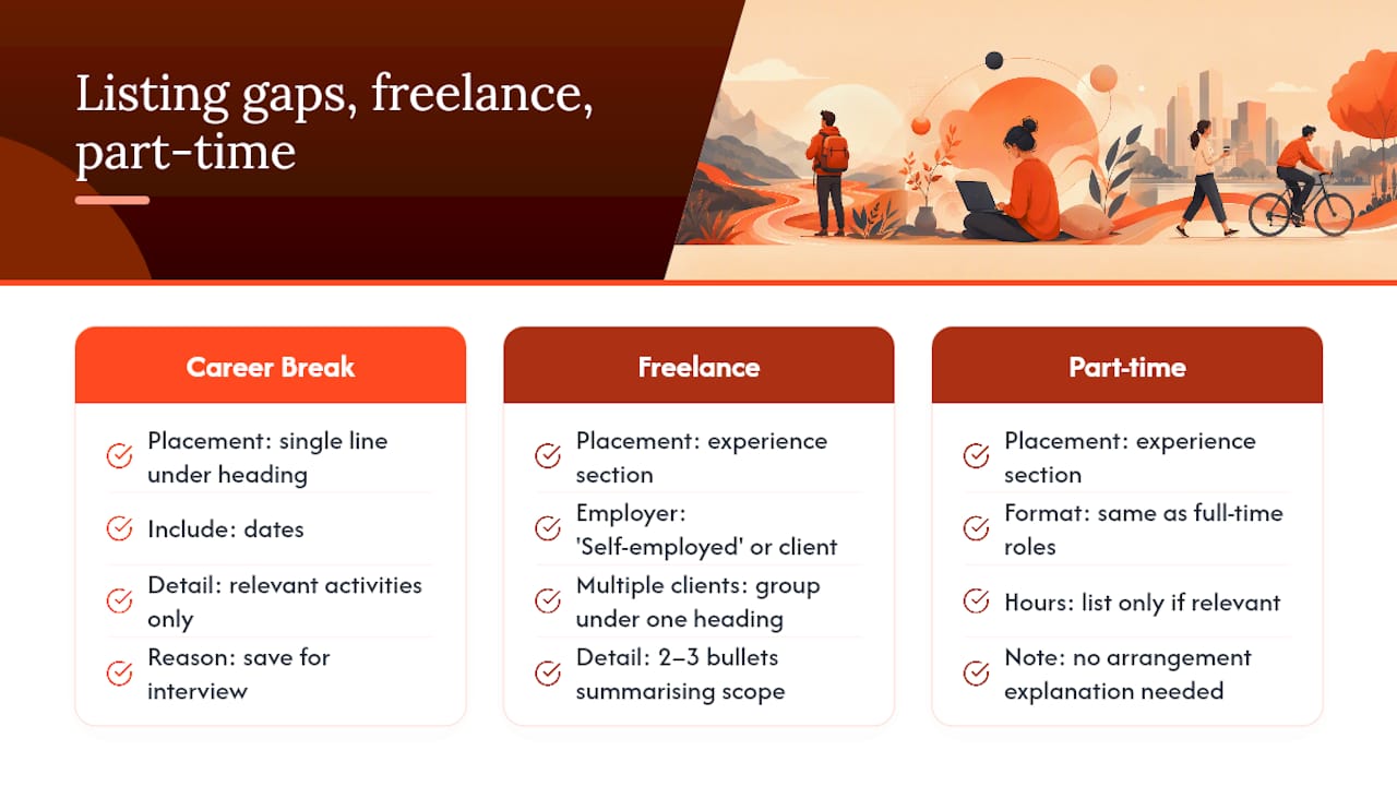
How do you list gaps, freelance work, or part-time jobs?
Gaps in employment do not need a dedicated explanation line on a one-page CV; the space is better spent on evidence of what you did during that time, if anything relevant exists. If you studied, volunteered, freelanced, or cared for family, a single line under a "Career Break" heading with the dates is enough. Leave the reasoning for the interview, where you can give it context a page cannot.
Freelance and part-time work belongs in the experience section like any other role, listed with the same title, employer (or "Self-employed" / "Freelance"), and dates format as your full-time positions. If you held several short freelance contracts for different clients in the same period, group them under one heading such as "Freelance Copywriter, 2023-2025" with two or three bullets summarising the overall scope, rather than listing each client separately. That keeps the section from ballooning into a list of one-line jobs that individually look thin but collectively demonstrate real, sustained work.
Part-time roles held alongside full-time study or other commitments do not need a note explaining the arrangement. List the hours only if they are directly relevant to the role you are applying for, such as demonstrating you can manage multiple responsibilities. Otherwise, treat a part-time job exactly like a full-time one: title, employer, dates, and achievement bullets.
How do you fit a career change or multiple roles on one page?
Career changers should lead with a profile statement that names the transferable skill or outcome connecting the old role to the new one, since a recruiter scanning quickly will not automatically infer the connection themselves. Follow that with a skills-first section ordering, putting relevant capability ahead of a job history that might otherwise look mismatched at first glance.
When you have held multiple roles at the same employer, especially through internal promotion, list the employer once with the dates spanning your full tenure, then nest each job title underneath with its own shorter date range and two or three bullets. This avoids repeating the company name and address multiple times, which wastes space without adding information.
For genuinely different career paths, such as moving from teaching into project management, select only the experience and language from your previous field that maps onto the new one. A teacher's experience "managing classroom schedules and coordinating with 30 stakeholders across a school year" reads as project coordination when framed that way, and that reframing is worth more page space than a full account of your old job title's typical duties.

Author perspective: what most one-page CVs get wrong
The most common mistake is not length. It is dilution: cramming every job duty onto the page instead of the handful of achievements that actually prove capability. A recruiter scanning for ten seconds does not reward density; they reward whatever sits in the top third and reads as immediately relevant.
The mindset shift that fixes this is treating each section as a pitch, not a record. German conventions add their own layer, since Lebenslauf expectations around structure and dates differ from UK norms, and getting that wrong costs more than a cluttered bullet point does.
Pro Tip: Read your CV backwards, from education to profile. Errors and filler jump out when you break the sequence you have read fifty times.
Alex
Let Appliqu handle the tailoring and the tracking
Editing one CV down to a single page is manageable. Doing it separately for every job you apply to, alongside cover letters and application forms, is where most job seekers lose hours they do not have. Appliqu tailors your CV and cover letter to each specific job posting, checks the result against ATS parsing standards, and can submit the application for you once you choose to move beyond manual review.
Appliqu's Explorer tier is permanently free, and writes 5 applications so you can see the tailoring quality before committing to anything. Sending starts with Core at €29.90 per month for 100 applications. Pro runs €69.90 per month for 300 applications plus access to the Appliqu Job Board. Concierge sits at €199 per month for unlimited applications plus a senior consultant session. All prices include 19% VAT. You choose between reviewing each application before it goes out, on approval or letting Autopilot handle submissions once you trust the tailoring. Start with the free plan on Appliqu and see how your one-page CV performs once it is matched against real job descriptions instead of a generic template.
Sources
- CV sections | National Careers Service
- How to write a CV | Prospects
- CVs | Oxford University Careers Service
- One-page resume template | Indeed
FAQ
How do I make a one-page CV?
Start by listing every role and qualification, then apply a relevance filter to keep only what supports your target job. Rewrite duties as one-line achievement bullets with metrics, consolidate older roles, and remove low-value items like references and unrelated hobbies before formatting to fit the page.
Is a one-page CV too short?
Not for graduates or candidates with under five years of relevant experience, where Prospects confirms one page is appropriate. Senior roles, academic CVs, and contractors with many short engagements usually need two pages to show enough evidence.
What is a one-page CV called?
It is usually just called a "one-page CV" or "one-page resume," though some recruiters use "concise CV" or "single-page CV" interchangeably to describe the same format.
Is a CV a one-pager?
Not by default. A CV can run to one or two pages depending on experience level and market convention; a one-pager is simply the shorter version suited to graduates, career changers with limited relevant history, and high-volume application situations.